Pokemon Trading Card Game

I've had like several different handlings of this set of articles over uhhh... I guess the 2 or so iterations of my site where I started making these blog posts and what not, and I really didn't like either of them. But I did generally like the posts. For the most part though, this is just me talking about a bunch of random cards I've found in the Pokemon TCG to be really neat. It's nothing special. I don't concern myself with things like the aftermarket prices for them (unless I'm looking to buy them). But like, since this hobby has been made kinda inaccessible to me and plenty of others these days, I just kinda made this page. At the moment, we're only on Gen 1, and going in order of ENG releases for the North American market, but like, I'll eventually get around to talking about promos and other sets.
Two things though, before I forget. The first is that I've made a little "card binder" of sorts, with all the cards we've talked about so far. You can check that out here. Second: Feel free to copy this idea and make your own, and even if you don't want to like actually make a commentary page and just make a page of cards that you like, you should do so. Really get out there and like, explore what the TCG has to offer. I really think it's worth it.
Pretty much all of the data & images for these pages comes from places such as TCG Market, Pokedata.io, and Bulbapedia. All my writing is off old blog entries until I add new stuff. Instead of sorting them by the date of me writing the article, I decided to just put the expansion set. Sorry if that throws anyone off.
In the future, I might make pages like this for both YGO & 1P TCGs. Look forward to it, I suppose.
Black Star Promos (WOTC Era)

Anyways, here's the final card of today's batch of "Cards I will yap about with varying levels of excitement and high amounts of random bullshit brainvomit." It's the uh... It's the supposed WTC Pokemon card. Because uh, yeah someone pointed out that the position of this building is very similar to where the top of one of the two towers would have been in relation to the Empire State Building. Of course, that could just be the internet making up bullshit, but also like... This is very clearly New York in 2001. This card was even released in 2001. I remember they supposedly wanted to even pull this card because of the reminder and the fact that it was released in November. There was also a debacle about the Pokemon Center opening back then iirc? I remember hearing all this in a youtube video so who knows how true it is. I'm not going to look up which one I'm just going to not check my work and continue to possibly spread internet lies. If I'm wrong, I'm wrong. I don't really care. I'll fix it later if it is, assuming someone has like proof I'm wrong.
-Guy who is Fine with Being Wrong about Possibly Incorrect Niche Pokemon TCG Lore
Anyways yeah 9/11 Pikachu.

Black Star Promos (WOTC Era)
Honestly, another banger of a card. I believe this one is from Super Smash Bros. It's just some random screen cap taken. Or I could be wrong and it might actually be from snap and the other ones not from snap and I'm just pulling things out of my ass. I could look it up, but I'm in a workflow state, so I can't actually. I will get too distracted on Bulbapedia. I can legtimately spend hours on that site. It is dangerous.

Black Star Promos (WOTC Era)
So, I have a funny anecdote about these cards. When I was a kid, there used to be this card shop that was right next to both a barber shop that my dad would occasionally go to, as well as a very popular restaurant in our city. It's mainly known for it's breakfast (which if you're ever in my area, I would reccommend completely--It's still open! However, I cannot tell you where it is without doxxing myself.) Well, that's besides the point I suppose. The card shop was somewhere I'd frequent because I always wanted to look at Pokemon cards, and my dad was a huge collector of sports cards. I remember sometimes I'd use my left over quarters saved from like, my lunch money and stuff, and buy the 25 cent cards. Well, I remember I only had 2 quarters once, so I couldn't get all 3 of these, so I only ended up with Zapdos (object of my childhood infatuation to some degree) and Articuno. I never ended up with Moltres. And I... never had a full set within an expansion for any of the birds rightfully together. I don't think I ever will at this rate considering how it's impossible to get cards right now. I can't wait for Pokemon Fever round... what, 4? 5? To die off already. I'm so sick of this. I WANT TO DO PULLS. IT'S NOT THE SAME IF I JUST BUY THEM ALL ON A MARKETPLACE. I gotta encounter the trio in the wild. It's gotta be fated.


Black Star Promos (WOTC Era)
Time for more Pikachus. Here's Flying & Surfing Pikachu. These also got a revival of sort, in the form of full arts that came out way later. But even the originals are still really cute. Like, look at him. He's having so much fun. I hope he has the greatest day ever. Go off little Pikachu. Go do those extreme sports!


Black Star Promos (WOTC Era)
Speaking of Grail cards, here's another. Cool Porygon. This guy is fucking awesome. I love everything about it. There's something so cool about the cosmos holo pattern in the background while this polygonal duck goes flying through cyberspace. He is surfing on a fucking rainbow down the information superhighway. Or... whatever they used to call the internet in the early 90s. They treated it like it was mythical. And I feel like that sense of "mythicalness" should be passed onto the digital duck.

Black Star Promos (WOTC Era)
There is so much Pikachu this time around. I am sorry but like, I do love me some Pikachu promos. Especially this one. I would say this is practically in the realm of grail cards for me. I'm pretty sure even the reprint of this one is super expensive for a non holo. Like seriously it's around 30 raw vs the original Holo promo is around 375 raw & a PSA 10 is a hefty 15.5k. Sorry to randomly bring up card prices (not like those matter to me outside of the literal limitation they have on me owning these cards) I love this card though. I dunno if I could cough up that much for cardboard but like I don't think it'll be on Pokemon cards anytime soon. We're going to ignore the growing pile of One Piece cards and the fact that I spend stupid amounts of money on a silly lemon man. This isn't about him. This is about Pikachu, damn it. Anyways I hope Pikachu has a very happy birthday I love you Pikachu...

Black Star Promos (WOTC Era)
Honestly, I don't know what this little guy is promoing. My assumption is Pokemon Snap. But I'm too lazy to look it up right now so I'll just speculate on it. Either way, I love CG graphics on Pokemon cards from this era. I just love the feel of them. Like we just don't get graphics like these anymore. I know you're probably like "you've literally already said this" but I'll say it again. This era of CG is just some of the most visually interesting graphics to come out of Pokemon. I love it. I miss it. Yeah it's blocky and rough around the edges but it's so charming.

Black Star Promos (WOTC Era)
So, here's some more of the movie promos. I didn't see the last one in the listings, but apparently the 4th card of this set was Electabuzz. Funny how I forgot all about that. I always thought it'd be another variant of Mew. In fact, I think deep in my mind, I hallucinated a version of Mew that exists like that. Oh well. I really like the little Pikachu here. So round.


Miscellaneous Promos
So, it's time to finally start tackling the promos, since we're at the end of the gen 1 stuff. Promos are kinda divided weird, because there's the well known Black Star Promos & then there's just Miscellaneous Promos. The Black Star ones tend to be a lot more well organized when you go looking at stuff for them, but the others are just a mess to look at. Maybe I should stick to Bulbapedia for info on them, though.
Also, when I comment on this category, I dunno if I'll make a distinction if they're out of the WOTC era. I only brought them up now instead of separately because I remembered this card, and thought it was a Black Star promo the entire time.
Either way, to the point of it all. Here's the Ancient Mew promos. The left is the US release and the right is the JP release. I never knew there was an actual difference to them, but they're both stunning in their own way. Apparently, these were given out only during the 1st week of the theatrical release of the 1st movie. I'm still mad at my dad for not letting us get our promo cards cos he was sick of the movie. I could have had this bad boy. Look at how sick that holo pattern is!


Gym Challenge
Honestly, I have no real reason for including this card. Other than the fact that this is how I feel about certain raid mechanics at times. And some of the dumbest ones. it's amazing how overly complicated mechanics will make sense in my head but a simple in out type thing will confuse me at times.
"That's wholly unrelated to Pokemon cards" Indeed it is. But that's how I'm deciding to end this blog off for now.

Gym Challenge
Another Porygon card. Yippie!!
Honestly, I don't know why all of a sudden sometime in the last 5 or so years, my brain just went "I am now a huge Porygon stan." But it happened. Either way, another great card, with another great aesthetic. The coupling of Sugimori's art and the circuitboard in the background gives a really neat vibe. Like yeah sure, this is another one of those "floating in the void" type cards, but this one is different. No. He's floating in Y2K Era Cyberspace. He's in the Wired. There's just truly something about his vibe that I love. I love all Porygon cards though. They're so neat. He's just a little guy. A little duck guy. Huge fan.
One day, maybe I'll make a dedicated Porygon collection... Truly the dream.

Gym Challenge
Pov: I am thundershocking you I am thundershocking you I am thundershocking you I am thundershocking you I am thundershocking you I am thundershocking you I am thundershocking you I am thundershocking you I am thundershocking you I am thundershocking you I am thundershocking you I am thundershocking you
Honestly, just a very cute Pikachu. The background is kinda neat, with the silhouettes and what not. Gives an interesting vibe, but I always thought this one was cute, regardless of that.

Gym Challenge
As a kid, I used to find this card to be so cool. An absolute favorite, that's for sure. Probably because Haunter was my favorite Pokemon and getting any Haunter cards was just a moment of excitement for me. These days, maybe not as much, but I still like seeing them, regardles.
As usual, the Sugimori lightshading art is one of those things that I just really miss. It's a unique style, for sure. I'm not really sure why people used to call it "lightshading" and if it was even really the name of the technique considering when looking closely at the illustrations, they look like they're just water coloring. But I do remember people pointing out how the style was probably influenced by how Akira Toriyama used to draw or something like that? And other people were calling it "lightshading" so I guess that just stuck. It's probably beyond wrong terminology, as looking up "lightshading" brings up completely different styles.
Either way, this one's pretty cool. I always liked how it shows Haunter floating above a house. I'm wondering if it's meant to depict Lavender Town or something like that, but as a kid, for some reason I thought this was a factory. Mostly because of the big chimney for some reason. Weird how child brains work.

Gym Challenge
So, this is one of two different "Giovanni's Meowth" cards within this particular set. This ones the higher rarity, being uncommon, unlike the common with the Sugimori illustration. Still, this one's got such a different vibe to it. I really love the gritty background, as Meowth either goes to stash more coins in his own treasure stash, or is maybe even taking from someone else's stash. Who knows? His sarcastic look also adds a lot to it, being very reminiscent of Team Rocket's Meowth in the anime. I honestly wouldn't be surprised if that was the inspiration for this card's illustration in particular, but I don't know enough about when this set was published in Japan to say for sure whether or not that had any influence. Still, regardless of the fact, just from looking at him, I can hear his Brooklyn accent, saying he's going to take my Pikachu or something (lol).

Gym Challenge
With that, we're beginning to get into cards that I definitely remember owning. Starting off with Koga's Arbok. Dunno why this card sticks out in my mind past being able to say, "Yeah, out of all the things that I did own in this set, that was surely one of them." Man do I regret selling those cards.
Anyways, the background on this sticks out to me. Mostly because even though it seems to be a generic pattern in the background, it still feels like it could pass for some sort of, I dunno, poisonous forest snake den or something. Or maybe it is some sort of plant or something in the background. I can't really tell, to be quite honest. But I suppose that makes it unique, as this set features a lot of random textures as the backgrounds for cards instead of full on illustrations. It makes those cards almost feel... I don't think the word is supposed to be "liminal," but it gives off that same uncanny vibe that liminal spaces have. These days, you don't really see cards with these sort of backdrops. They all have full illustrations and the cards come off as far more polished. If they do have a random texture backdrop, the illustration is so big that it tends to drown it out and you barely notice it. I guess that makes them far more nostalgic in that sense.

Gym Challenge
I love this little guy. Don't know what it is about simple Ditto illustrations, but they're some of the best cards. He just looks like a fun stretchy guy, with his happy little smile. I also love that the card isn't really drowned out by holo as well, which makes it incredibly neat, considering so many of the others just kinda get overwhelmed by the sheer amount of holo in the background.
Honestly it kinda sucks that there doesn't seem to be a lot of early retro Ditto cards. I think between Fossil, Challenge, and a vending machine card, that's about it until Skyridge. After that though, the amount of cards definitely picks up considering the amount of Ditto cards they tend to make that are transformed.
Transformations aside, I really do like Ditto cards that are just Ditto being Ditto. Neat little guy. Always wondered what one would feel like.

Gym Challenge
Dunno what it is about random cards that I see where I'm just like "That guys awesome, I need to have him." But this guy right here is pretty awesome, and I need to have him. I've never been too keen on using Beedrill in the games simply due to how... not good early generation bugs tend to be. But there's something about the design that really calls out to me. Which says a lot considering this guy is just a wasp. Not even an actual bee. I wish Beedrill was good. But despite Beedrill not being all that good, at least there's always cool card art, right? The very retro light shading of Sugimori's illustrations and the fact that he's next to some sort of vortex of multicolored holo swirling around is just neat to me. I realize that's probably a nest entrance or something, but it's still unique to see.
Actually, the aftermarket on this guy isn't too bad, maybe I'll pick one up.

Gym Challenge
I should probably have prefaced this entire article with Gym Challenge being one of those sets of cards that I really didn't collect from all that often. In fact, I don't remember if between Challenge & Heroes, which I collected less of. Maybe that's why I'm just grabbing at the holos I remember seeing in those little pamphlets and showing you the ones I thought were coolest. Because I had like... None of them.
Either way, here's Giovanni's Persian. While I'm glad that they included the pillar in this one, it does have a really weird feeling as if Persian is just walking into the void. I wonder how they decide which parts they decide to make holo and if it's just the way scanners pick up the backgrounds of these cards that make them look like that. Either way, it's an interesting look.

Gym Challenge
I figured I'd start this article strong by talking about one of the most popular cards in this set. This is Blaine's Charizard. Out of all the early Charizards, this one's the coolest. There's something about being mid flamethrower, and being able to actually see the flamethrower on the card that makes it look pretty cool. (Looks at the original Base Charizard and how the Eng print changed the foil on that for whatever reason)
Anyways, aside from casting shade at Base Charizard, this is one of those cards that I really wanted as a kid. I remember our local shop used to have it displayed in a cabinet. I really wish that shop was still around, because all our shops out here are now gone. I have to go into adjacent cities just to find stuff. And when I find stuff, unless I go to Frank & Sons, it's usually never vintage.
One day though, maybe I can have a WOTC era Charizard... Without it costing me an arm and a leg.

Gym Heroes
Last card for this entry. Anyways, here's the Pewter City Gym card. I mostly included it because it felt like a good idea to bring up that Stadium cards were added in this set. These show up quite a bit in the future, and yeah, they mostly come from the Gym Heroes & Gym Challenge sets.
Honestly, the 3d renders with the gyms are kind of neat, simply for how surreal they look. These days, people would probably classify them as Liminal Spaces or something along the line. Normally, when you think of a gym in Pokemon, you expect to see trainers battling. However, these don't have anyone, nor do they really have any signs of life. So, they just end up looking a bit odd.

Gym Heroes
Another trainer. This time it's Misty's Duel. Honestly, I guess it makes sense that they'd have cards where you'd play Rock Paper Scissors to win something instead of just the usual coin flip, but I think it's kind of rare for cards to have that. Either way, I mostly remember this because of the illustration. It's pretty cute.
I do remember someone I knew once being a bit weird about this card, because the color of her swimsuit looks very close to her skin tone, but you can see the lines? So it feels pretty obvious that she's wearing a swimsuit instead of being naked. But then again, I think another Misty card was censored in the states for a similar issue.

Gym Heroes
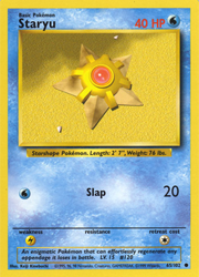
Honestly, this is one of those cards that I remember having tons of. I think an average deck usually allows you to have up to 4 copies of any given Pokemon, so it made sense that I'd have at least 4. But for some reason I remember having like 10 of this guy. And it's not like I'm particularly super fond of Staryu or anything. Either way, I figured I'd include it in here for the sake of it. Because honestly, why not?
Anyways, I suppose I'll take this time to comment that the bottom of the cards was changed. We no longer have the dex entries at the bottom, and instead the weakness, resistance, and retreat cost are put on lines. They also squished the gym leaders and their badges into their corner, which is a neat addition.

Gym Heroes
Here's Rocket's Snorlax. I think it's really interesting that despite this being a Team Rocket owned Pokemon (Instead of a Giovanni owned Pokemon), it retains the darker finish around the illustration of the card, rather than the regular yellow frame that most Pokemon cards tend to have. It's interesting. While I was editing this, I thought I had almost put the card in the wrong section. But no, it's correct. The symbol at the side definitely shows that it belongs here.
Either way, the illustration is really cute. Even if poor Snorlax is essentially sleeping surrounded by trash. Please, for the love of god, clean up his room.

Gym Heroes
I'm sure that anyone who played TCG Pocket at launch probably got jumpscared by this one. This is the original Misty card. And she's a holo. I remember having this one specifically, but also the non holo variation of it as well. I was always super proud of it for whatever reason. Wish I still had it.
Either way, this card plays completely different from TCG Pocket, and that kind of took me by surprise at first. Like, it makes sense. A TCG is going to have to change over the years with playstyles and what not. And it's completely ridiculous to expect older cards to not update. But it's interesting to see this original Misty card and remember that initial Misty deck from TCGP. I'm pretty sure that deck is completely outclassed these days though.
The blue holo in the background of this one is pretty. I wish the badge outline was also in holo, just as the patterns behind Vileplume were, but instead it's printed regularly.

Gym Heroes
Erika's Vileplume is the first card we're looking at today. I think these cards are the introduction of owned Pokemon rather than just a regular Pokemon, or in the previous set's case, Dark Pokemon. It makes sense though. After all, the set is themed around the gym leaders of the Kanto region. I don't remember how many other instances we have of this off the top of my head, but I do know that these cards come back from time to time. I remember quite a few of them showing up in Generation 4 with Sinnoh trainers as well.
I believe with these ones, you have to evolve it from an owned Basic or Stage 1 Pokemon from the same gym leader in order to play it.
Either way, this is a very cute Vileplume card. I didn't actually own this one, but because I didn't want this article to be tiny, I decided to stick it in there. It looks liket here's a flower pattern behind Vileplume, and that's pretty neat.

Rocket
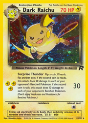
We have the final card of this set, and the final card I'll be talking about for this entry. Yeah, it's Dark Raichu time. This is a very special card. It's so special, it's actually 2 firsts! First off, this is the first card made exclusively for Wizards of the Coast and the English TCG. We didn't get a whole lot of these. Hell, this might be the only one? And much like plenty of others, I'm also mourning what Jamboree could have been. Either way, for the Japanese sets, this card was later printed in Neo Discovery.
Moving on, this card is also special in the sense that it's the first Secret Rare. As such, in english, its 83/82. In some sets after this one, the secrets are included in the overall card count. But in other sets, they're not included at all. If you'd like to see the other Secret Rares, I highly suggest checking the list on Bulbapedia as there's so many these days, they're all so hard to keep track of.
Rocket
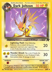
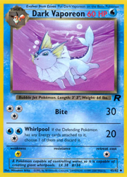
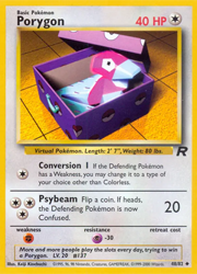
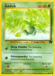
Let's take a break from all the firsts in this set to talk about some regular card art. Here's a selection of card art that I particularly find neat. I had almost all of these, with the exception of Porygon. That guy always seemed to ellude me when it came to collecting. Odd, considering I've become so fond of him as of late. And he looks so cozy in his box. Like he's ready to be adopted. I don't know about you, but I would spend tons of time in a casino as a child, eager to take this guy home. Team Rocket be damned, I'm getting my polygonal duck.
Ducks aside, Jolteon and Vaporeon tend to be favorites in terms of illustrations on cards for me, I suppose. I always told myself "I'm not an Eeveelution person" but honestly, looking at the amount of cards of these guys I tend to like, maybe I am the Eeveelution people... It's all beginning to make sense. Also, the Oddish is a favorite card of mine in this set. It's so cute. I love the little frog, as well as the vibrant greens used here. When it comes to card art, this is an absolute favorite. And I think it's someone else's favorite as well. When exploring Neocities sites, I remember seeing it on the landing page for DAIKONET. And I think that's awesome.
Rocket
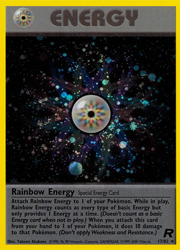
Rainbow Energy is yet another first for the Pokemon TCG. While we had Double Colorless Energy already acting as one type of "special" energy card, Rainbow Energy was the first to take it up a notch. That's right, it's another case of a first holo. From here on out, every once in a while we'd see special energy cards, whether it be in the form of special holo versions or special designs on the energy.
Other than that, it's still a unique type of energy, but I'm unsure if we have too many super unique types. I don't remember off the top of my head, to be honest. I suppose that if we do, they're much newer in the TCG than this, or probably from an era where I wasn't collecting as much.
also the holo here is once again, very pretty. I like the dark blue-black color here.
Rocket
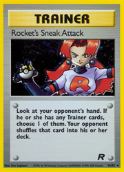
Another holo of a Team Rocket trainer. This time, we have a grunt. She looks pretty cool, with the striking red hair and the white uniform to contrast with the black one.
Pretty sure that these are some of the first holographic Trainer cards we've seen in the TCG at this point as well. This is another thing that originated in this set, and we'd start seeing holo versions of Trainer cards, which would eventually turn into even more special variants of trainer cards.
It's a shame that much like Weezing, the holo on her is very dark and doesn't look as present as some others. But I guess it makes it better than "Here Comes Team Rocket!" because the illustration is so big that it doesn't leave as much room for the holo to peak through.
Rocket
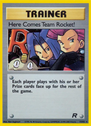
Here Comes Team Rocket is one of the first times that Jessie, James, & Meowth breached the containment of the anime into other aspects of Pokemon. It's kinda funny. Like yes, they're in the Yellow version of the game. But that version pretty much exists to mimic the anime. So it's kinda funny to see Anime-only characters here. I know that Ash & other anime exclusive trainers get cards, as well as the anime counterparts of some trainers get cards specific to their anime counterparts (Like, I believe there's a set of gen 3 promos where Brock gets a card that is specifically for the anime version of him.) But usually those promos have promotional anime art and they almost seem uncanny. Unlike this which is very much not uncanny and drawn specifically for the TCG. Pretty interesting, and not the only time the Teams Rocket trio has shown up.
Also, they look pretty good in their black uniforms. A different look from the anime.
Rocket
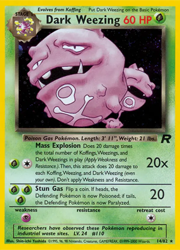
Another card I remember very vividly. It's almost funny how much I remember holding it. Odd thing to be able to picture in ones mind, I suppose, but considering all of these articles are very much steeped in nostalgia, I guess it makes sense.
Either way, this card is indeed the holo version of it. But it's very hard to tell. If you think I got the wrong version of the card, nope, you're wrong. This is definitely the holofoil of it. This card's holo is very dark, even in person. I know that I've constantly commented in the past that some holo cards tend to make the backgrounds look like they're not even there, but this one does it a lot. It looks the same in hand. It's so dark that it almost doesn't seem holo. Weird card, and it doesn't feel impressive for that reason. Or maybe it is impressive, but for the wrong thing.
Rocket
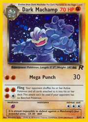
Dark Machamp is the next card on our list. I'm pretty sure I got this card in one of those set boxes or something. I used to buy a lot of those, because it always felt like a good deal. A ton of cards to open up, and usually a pretty good price. And a decent place to get some older sets, as well as coins and all kinds of other goodies.
I wonder why I always remember these boxes in particular when it comes to some of these holos. I definitely did a lot of individual pack openings as well, especially for this set. So it's funny to remember the boxes for some of these. Anyways, I also had a lot of the non-holo version of this card as well. But I suppose when you do a lot of pulls, it's only natural that you'd end up with a ton of variants of a card.
Rocket
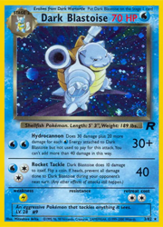
While I don't think I ever owned my own copy of Dark Blastoise, I couldn't help but put him in. This is such a cool looking card. I remember having Dark Wartortle specifically, who sits with his arms crossed, almost glaring at the trainer. But never the Blastoise. Even so, the pose is very cool, and the bright blue holo with the cosmos pattern is very pretty. I think if I were to aim to get this set these days, I'd definitely want a copy of him.
I guess I'll talk briefly about the Dark Type Pokemon cards. Not to be confused with the literal Dark typing in the game that's more akin to element system, though. They're supposed to be Pokemon corrupted by the influence of Team Rocket. In Japanese, the "Dark" label is replaced with わるい, meaning "bad." We'll see these types pop up again for sure. Some of the differences are the borders around the cards being different. The Pokemon themselves also have lower HP, which is traded for higher attack power. I believe I also remember reading that any regular Pokemon can evolve into a Dark Pokemon, but if it's a 3 stage evolution, then the 3rd stage must also remain dark. However, I went reading on Bulbapedia, and I didn't see this confirmed (Not that I dug very far,) so I don't know if I'm misremembering this or not.
Rocket
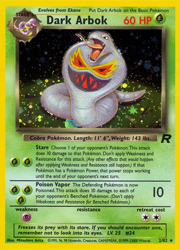
Starting this article off talking about Dark Arbok. This is probably one of the most memorable cards in the set to me. Not that I'm particularly fond of Arbok or anything, but I remember having duplicate Holo of this, as well as the regular. I could have sworn I had a Promo of this card as well, but looking up the information, there's no way I could have acquired it myself considering it was for a tournament in Hong Kong, and I've never been. So, I think I'm misremembering.
Either way, this is a pretty neat holo. You don't tend to see lighter lemon-lime greens in holos, only those very vivid bright cool-toned greens.
Base Set 2
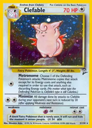
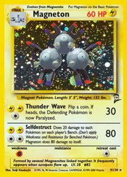
So, I would do a section about these two, but since I already covered them, I decided to skip it because I didn't really want to be redundant. However, I felt like showing them as well, because the cosmos holo looks so nice. I could have put more here, but I didn't really want to. I felt two would suffice.
Base Set 2
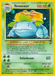
This one feels a bit special, out of all the Base Set 2 stuff I had. Or maybe just in general. Whenever I'd open my binder, it was always the first card I saw, as it was always the first position of the first row on the first page of cards. Y'know, in those really not great Ultra Pro binder sleeves for cards. The ones that you're definitely not supposed to put cards in because they're generally just not good for storing them? Yeah, I was one of those kids but so were most of us. That's just a symptom of growing up during Pokemon Fever, I suppose.
Still, I suppose this one's also particularly special to me because of that. I think the background is supposed to be Venusaur in a forest or something, but it's drowned out by the very green holo. Like a very emerald green. Really pretty. Definitely a card I'd like to pick up again in the future.
Base Set 2
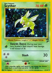
This is another one where I'm left a bit speechless. Like my eyes are drawn to the Scyther holos of this era (Both this and the original), but I'm not exactly sure why. Stepping back and looking at it, it's more of the vaguely colored backgrounds that get drowned out by sparkles. However, this one is so dark that it's hard to even tell what colors exactly are here. I know that's part of the charm in some cases, but it still feels a bit weird to look at a murky background that sparkles with a very plain Scyther in the middle and have your brain go absolutely wild seeing it.
IDK, probably just little TCG things
Base Set 2
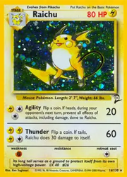
Here's Raichu's holo. Honestly, while it's holo is very pretty with the bright yellowy-green surrounding him to really make the artwork pop, I have no real strong opinions past that. It just looks nice. But I suppose that's what I feel about most cards. They just look nice. Sometimes there's a story there, sometimes it's just a smattering of nice colors with some pretty sparkly stuff. And I guess both of those are good enough for me.
Honestly though, if anything, I really miss the times when the Pikachu line was so much more round. Who doesn't love a round little guy?
Base Set 2
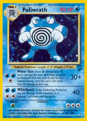
So like, what if once again I just talked to you guys about water effects and particles and just everything related to the watery aesthetics of video games & video game related art during the late 90s to early 00s? Yeah, surprise guy named "water" likes the aesthetic of water and loves the part it plays in Pokemon cards.
I know you can argue that it looks like it's barely there, but the fact that it's there is huge. Poliwrath has this cool holo effect over some bubbles, and with the cosmos pattern, it makes them look all sparkly. Since the background is pretty dark, it makes me feel like this battle would be taking place deep under water, perhaps while you slowly sink further and further. Kinda has a Depths vibe, but I won't go on a 2kki tangent here. I swear.
Base Set 2
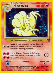
So, I will admit, I tried to go into this article without putting particular focus on the holo pattern for every entry, considering the entire article is going to be related to holos. This is already feeling kind of hard for me, and we're only on the 2nd card.
Ignoring my past self's advice, I think the holo pattern really makes this card shine. It just looks so much better over the original stardust or whatever it's called foil pattern. It's just so aesthetically pleasing, and adds to the will o wisps feeling that Ninetales is associated with. Super cute card.
Base Set 2
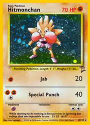
I don't know why, but my brain always associates this card with the starter deck. Even funnier because I know I didn't get Hitmonchan, or a whole lot of anything Base in the beginning, and I sure didn't have the decks from Base, that's for sure. Still, the mere appearance of Hitmonchan really does bring back the feel of those prepackaged boxes. I know that this is most likely due to the fact that the original Base variant is featured in one of those decks. But like I said, never owned those ones. Either way, I've never felt particularly strongly about this card. He's just a guy who hits.
Fossil
I was going to try to put some sort of gag in, like I had originally forgotten about this card and just got confused. However, the more and more things i attempted, the weirder it ended up looking. So I suppose I'm ditching that idea and just talking about the card. But please do know that in the spirit of all things Slowpoke, I was absolutely ready to make some sort of joke about not even realizing there was a card to talk about here. It's just that the text overflow would have taken way more work than it was worth and I just am too lazy to deal with that at this point of the night.
Either way, this image is literally "cards I can hear." I don't know if Slowpoke's original cry is the same as what we have these days. Honestly, I don't tend to play Pokemon games with sound on the majority of the time anymore. After a while it gives me a headache, even if the music is good. Just know that I can hear his original Gen 1&2 cries when I see him. Silly little guy. Honestly just included the card because it's cute. That's all. Glad to see him represented in TCG Pocket as well.

Fossil
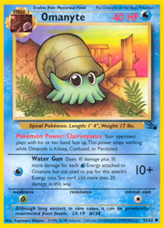
So, this version of this card isn't the one that stands out to me the most. Honestly, I remember getting a reverse holo in the legendary set of this card, with the super busy holo pattern background, and that one just sticks out more than this to me. But I suppose I can talk about that when I talk about Legendary.
Either way, in general, I always thought as a kid that this card was in Greece. Another weird kid thing I had going in my mind was that eventually I'd see him in the Hercules Disney movie. Even weirder was that when I eventually got into Kingdom Hearts a few years later, I always still thought I'd see creatures like Omanyte in the Olympus Colliseum. Don't know why my brain told me that outside of the pillars in the background but I guess whatever worked for my 10 year old brain just worked.
Fossil
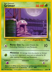
So, I definitely pulled this card at some point. But that's not why I remember it these days.
I mostly remember it due to this stupid comparison that someone I knew who I don't associate with anymore made when it came to parsing and learning your rotation in FFXIV (Because we all know the act of learning one's rotation is solely for parsing, and not because you legitimately want to learn how to play your class in a way that isn't griefing, right? Especially if you want to do endgame content on said class!) They basically went on this tirade on how toxic it is to expect people to learn their rotation and how it essentially makes you toxic sludge and posted this card (cropped.) So, every time I see it now I can't help but just laugh.
Either way, play FFXIV how you want, but please don't get mad when people don't want to do things with you because you make every excuse to be a detriment to a raid when everyone else is there to prog and clear. Posting Grimer pics will win you no favor. If someone does this to you, I don't know, hit them with a Zubat or something.
Everyone who reads my blog is probably never going to want to play FFXIV with me when I finally decide to play again at this rate due to all my raid horror stories, LMAO.
Fossil
I've never particularly liked Magmar, to be quite honest. Despite that, the illustration of this card has always stood out to me. It's nothing all that special. But the location is kind of interesting, I must admit. My main question is just "where is this place?" And I know, I say that about quite a few cards. I know I definitely was asking it about Persian in the last TCG post, but I'm asking it here as well. Where Is This Mans Located?
Real talk, the location isn't as interesting to me, as much as deciphering if he's on some sort of volcano that recently errupted or if that's some sort of cave, with lava that flowed into it and he's in some sort of like, den of some sort. Why do I bring that up specifically? Because that's how my brain always interpreted it as a child. However, now that I look at it, it looks like he's outside. Who knows. I'd say, "What do you all see?" but I don't know how people would communicate with me. Email me, I guess? Or even funnier, just flood my cbox with messages about what the hell the Fossil Magmar is doing. What is he up to? Where is he going? Let's solve this together.

Fossil
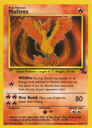
When it comes to the Pokemon TCG, I bear a single curse. And that curse would happen to be the curse of Never Being Able to Pull All 3 of the Original Legendary Bird Trio from any Set Released Ever.
Honestly, the amount of times this has happened to me is frustrating. And yet, it continues to happen to this very day. Even in TCGP, it continues to happen. I'll never have all 3 birds.
Anyways, needless to say, I pulled this Moltres. Much like Gengar, I never owned the holo for this. Pretty sure there's a holo for it. I don't know. I did the research for this article over a month ago, and I'm just barely writing it at the end of January. I'll go look again later, because if I do that now, I'm just going to get distracted.
Fossil
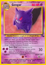
Finally, our first Gengar card. And naturally, I only pulled the non-holo variant of it. Kinda bummed me out as a kid. But either way, still cool to finally have Gengar.
I'll try not to type another essay related to how much I love the renders on these cards. I feel like at some point, I'm just going to be saying the same things over and over about them. But I still do love them. Either way, he looks so silly in this one, with his eyes going in opposite directions. Love that for him.
Also, I remember my copy of this card had a giant ass crease down the middle of it. Really hated that. I think someone sat on it once. My dad, probably. I remember having a fit over this, and never being able to replace it somehow, because I never pulled another copy. I won't lie, I didn't have that many pulls in the original 3 sets. And yet, I remember them all so vividly. Weird how that works.
Fossil
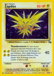
Am I bringing up the same old Pokemon again? Yeah, maybe. But also, back as a child I didn't exactly have the luxury of just buying whatever cards I wanted and simply had to deal with what I got with pulls. But I will say, I did actually pull this Zapdos unlike the previous one. I suppose that's why it stands out to me.
Well, other than the fact that it's Zapdos and I had an issue where I was convinced he was real. I'm not retelling that story again. Just know that I didn't visit that park for a while, and at some point I had become convinced that Zapdos would eventually leave, but couldn't get anyone to take me there. Probably for the best, so I didn't end up getting electrocuted but whatever. Either way, neat card.
Fossil
So, here's one I actually had as a kid. Magneton. Was it anything all that special? Yes and no. No, because I've never been super enthusiastic about Magneton. Like, yeah they're kind of neat. But I have no particular feelings towards them. But also yes it was special because it was a shiny card that I owned and that made it super special and cool and awesome to me. And that's all that matters when you're 10 and you're still into Pokemon while everyone around you has moved on.
Anyways, this Magneton card is pretty cool, mostly because of the background. The previous one was yellow, along with the electric type card, so the thing that made that one stand out was the render being 3D. This one stands out not just because of the Sugimori art, but also the contrast being really cool. Also, the wavy background definitely helps.
Like the other Magneton, I was definitely given this one. I don't know why I remember that, but I just do.

Fossil
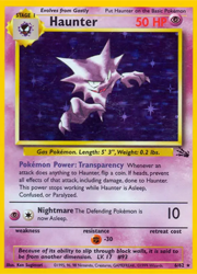
This right here is the other card that I did not own as a child. But I will tell you, it is absolutely the one card that I wanted the most. Why? Haunter, but with holographic sparkles. If you're asking "Is that all it takes to be wowed by a card?" Yeah, it kinda is. I think I've stated it before, but back during the days of Generation 1, all a card had to be was shiny, and it was an awesome card. It's kind of why when I get newer cards, I'm still amazed by them even if it's what someone considers to be a "dud card." Like sure, you can tell me something like the cards value, and I am just not going to care. Especially not for a card that has my favorite Pokemon.
Anyways, let's focus on the card. I was lucky to pick this one up at Frank & Sons, which is a vendor show. Think of a convention floor. Now think of it being held 3 times a week, but all the time. That's what it's like. I didn't have plans to buy this guy. But when I saw him, it just kind of happened. Really happy with my choice. I love the oldschool Ken Sugimori Pokemon art with the light shading. The fact that the card is just all purple as well is also really cool. Anyways, really neat card, couldn't be happier with it.
I'm sure someone could go and call this a 'Healing Your Inner Child' type purchase, but I'd never give this card to child me, because child me sucked at taking care of cards. This is for adult me.
Fossil
Not gonna lie, I'm just straight up going in set order this time, so we're starting off with Ditto.
So, I'm just going to get this confession out of the way real quick. When I was going through the cards of this set that I had, I only came up with 8 that popped out at me that I knew I absolutely owned as a kid, and one I now own because I wanted it a ton as a kid. So that's 9 cards. But that felt kind of short. What does that have to do with Ditto? Well uh, absolutely nothing because I will confess that I didn't even really realize this card even existed until I went looking for cards for this article. "Doesn't that defeat the purpose of this article?" Yes. Yes it does. However, have you ever seen a card so cool that you just throw the article you've planned to write's rules aside completely and just stick it there for the sake of it? Because that's what I feel about this Ditto. Never have I wanted to own a retro card as badly as this particular Ditto with maybe the exception of one other. And I'll talk about that other when I get to Black Star Promos. But either way, this Ditto is amazing. Awesome. Love this guy. Cannot put into words how great I think he looks. I dunno if I'd get him graded, but I'd definitely get him. Hell, I have money. I could look on TCGPlayer for him right now. But I need to write this article so I won't be doing that. Anyways, I'm a huge fan of him. Absolutely stunning. Marvelous. Gorgeous. Love this guy.

Jungle
Anyways, I'll wrap this up with this Oddish. I never had the entire Oddish line for this set, but honestly after seeing the Vileplume while looking through all the cards, I could be persuaded to buying them all. More great vibes. Like I said in the last article, I love these early 3D renders. They're just so charming. Like yes, theyre janky. But these illustrations add such a sense of wonder. If you didn't play the games or watch the anime, it's still so easy to get a sense of what the Pokemon world is like, just through these pieces of art. I wish they existed as some sort of screensavers with simple animations. That would be so cool.
I wont lie, part of me is tempted to go track down all of Keiji Kinebuchi's card art and just make a collection. The vibes of his artwork is just so cool, with the early pc render models & all. Unfortunately, while reasearching on Bulbapedia, I learned he passed away in '02, and the last set to feature his art was Aquapolis. Very sad to hear this, but his work lives on in the fact that most of the element symbols are his creations, and are still used in cards to this very day.

Jungle
For those of you playing the tcg pocket app, I'm sure you recognize this Meowth due to the recent events. Well, for those of you who didn't know before now, that Meowth originates from Jungle. It's really fun seeing all the card art in TCG Pocket, with it's mix of both old and new.
Jungle is really quite nice for the amount of cute and soft yet vibrant art in it. This set really has quite a bit of that. Below this is a few examples that I don't really have any particular things to say about, but are generally really nice. Immaculate vibes up in this bitch.


Jungle
Speaking of the Persian card, here they are with Meowth. I love these two cards. They're just super cute, and the colors used in them are great. There's something about all the purple that I really love. Makes the both of them stick out.
The absolute level of smug Persian gives off while sitting under this vibrant, almost magical looking tree due to the colors is really interesting. Like, there's a sort of playfulness, almost beckoning you towards them. I wonder what would happen if you approached a Persian like this? Would you be able to pet them? Would you play? Or would you just end up getting pounced, or even clawed? Perhaps Persian would just act as a distraction, while a group of their Meowth underlings came up and took your lunch or maybe even your wallet? Who knows.
Another question I have is just... Where is this supposed to be? Is it a real place in the Pokemon world or is it just some random unnamed field out in the plains. My brain wants to say "oh its the Safari Zone, definitely," for some reason, but even then, I can't be too sure. I suppose that unless there's some sort of definitive answer that I'm unaware of, we'll just never go. I like the Safari Zone idea though, even though I don't think you can find Persians there.


Jungle
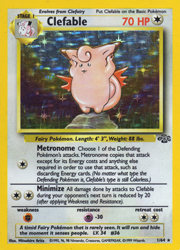
And for the last big pull that I remember having from this set, Clefable. This art also always stands out in my mind. I'm unsure why. I guess it's just because I owned it that it does, which always adds a sense of nostalgia. It's a pretty cute card. I like it a lot more than the previous set's Clefairy. It's a bit hard to see when you're looking at it online, but Clefable seems to be standing in a field, presumably near Mt. Moon, and seems to be dancing. Really cute card, all around.
I wont lie, as a kid, I was always under the impression that the forest was super pink and lit up during the day for some reason, but I'm pretty sure that's supposed to be the moon in the background? Seeing as how Clefairy and Clefable are implied to be from outer space, it makes sense. I think the reason my brain might have seen it like that stems from the coloring on Persian's card. It could also just be from the non-holo version of the card itself. I kind of didn't think to check the regular variant of the card before sticking it in this entry.
Jungle
So, I will admit that I didn't pull this card as a kid, at least not to my memory. But I will talk about it anyways, because it is currently in my posession. Kangaskhan isn't a really spectacular card, I will admit. While I was shopping around tcg sites, I saw someone up with a cheap one in decent condition, and decided to see how bad the damage was (on top of really wanting to understand the damage scaling,) so I ended up with her due to that. Not the worst condition tbh. It's interesting to see how card sites grade these older cards and how they deteriorated over time as well. With the super old holos, there's always damage around the edges due to how they were printed. You can see silver as the border of the card deteriorates, due to the way they're printed. But I guess it's kinda part of the charm of buying these old cards.

Jungle
Sorry to skip around so much when it comes to the order of each card. Back to the holos of this set.
Lets talk briefly about the Eeveelutions. I guess it feels a bit silly to say this when I'm admiring card art, but I've never been particularly keen on the Eevee line. Like yeah, it's a really neat concept and all, and I don't hate them, but I'm just kind of whatever about Eevees. Neutral would be the best way to put it, I suppose. Like, "Those are some neat lookin dogs," is about the epitome of what I have to say about them. If i had to pick a favorite, it'd probably be Jolteon and Espeon tied for first, with Umbreon following right behind. IDK, I don't want to go off on a super long tangent about my feelings on the Eeveelutions on something about card art, I suppose. As I said, I don't hate them or anything, I'm just not the target audience here.
With that said, I never got all 3 Eeveelutions. I just ended up pulling the 2 as holos, but never ended up with the Flareon card. However, these two are really nice. The Vaporeon is just stunning and is one of my favorite illustrations for the tcg to this day. There's just something about it. I'd say it's easily the best card in this entire set. Nothing else really comes close to how nice it is. Just an amazing card all around. It really does scream "This is late 90's Pokemon artwork" to me. I guess it's because you just don't see card art like it these days. There's something about Himeno's early artwork that just has a mystical 90's anime vibe. And maybe it's the bubbles in the holo that make me feel this way, but it just really gives off Sailor Scout henshin type vibes. I could totally see this Vaporeon chillin alongside Ami on a day off, and then jumping into battle whenever Sailor Mercury needs to fight.IDK, that's just the image this card evokes in my mind. Kinda silly, considering it's just cardboard in the end.
On the other hand, we have Jolteon. I feel like there's not nearly as much to say on this one. The Jolteon card just has this sense of playfulness that you would get from an electric dog. I feel like if you threw soemthing for them, they'd just go off running, only to be back in a flash, waiting to go again. They'd probably bring a ton of static electricity with them as they get back too. Just seems like a silly little guy, that's all.


Jungle
Well, I suppose on the topic of first cards, it's only fair to bring up this little guy before any others as well. While I managed to pull an actual holo in my first pack, my sister really only got this little guy. But as a huge Pikachu lover, I was like "Woah, I want a Pikachu too," and then proceeded to beg for Pikachu. Mostly under the argument that she was 3 and I was 8, as if that meant that I was going to take better care of my cards somehow.
Spoilers, I didn't.
Anyways, this is another classic Fat Pikachu card. I believe it's by Sugimori himself, considering the style and the light shading. It's a really simple one, nowhere near as painted as the original Base Pikachu, but still pretty cute either way. He's just chillin' in the forest. What a little guy. Big fan.

Jungle
So, I'm going to start off with some of the holos this time, rather than doing them whenever. And the one I picked to start this set out with is Venonat. I'm sure you're like "Why Venonat? This isn't a particularly neat or special card." For you, maybe. But for me? This was actually in my first pack of Pokemon cards I ever opened. So it ended up being pretty special to me. I couldn't tell you what else was in my first pack. I honestly forgot. But this guy has always stuck out to me just due to that fact.
I did end up buying another copy of this guy, I think last year? I went to Frank & Sons (A local collectors show held on select days of the week. If you're in Southern California at any point, I highly suggest seeking it out if you're a collector.) I saw it in a vendors case and decided to pick him up, so now I have a copy again.

Base Set
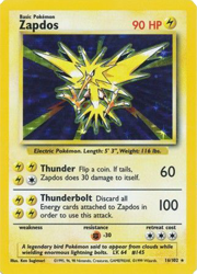
So, this will be the last card I talk about in this blog, but I feel I definitely saved the best for last. Here's Zapdos, one of the original Legendary Bird Trio.
I didn't pull this one, but I distinctly remember getting it from someone at school. I want to say I traded, but nothing comes to mind that I pulled that I traded for it. Hell, most of my Base Set pulls were well after Jungle had come out. Back then, Pokemon cards sold out like crazy. People have claimed "Oh, Pokemania has come back several times and it was always the same." I suppose that's true to a degree, but nothing felt as wild as the first Pokemania. Anyways, I bring that up because, as I stated, the first ever pack I ever opened was Jungle and here I am talking about Base Set cards. Obviously, I wasn't a Day 1 Base Set buyer, but at some point I did get my hands on Base Set packs. I don't' remember how though, but I suppose that's kinda irrelevant. Back to Zapdos.
So besides not remembering how I got this card, I did used to have this obsession with Zapdos as a child. Like most children of the era, the idea of Pokemon being real thrilled me. Unlike other children my age though, I wasn't exactly convinced on some of the playground arguments on how they could be somehow real and we just didn't know yet. Most of it I knew to be make believe, even back at 8 years of age. But, there was one thing that gave me hope. Oddly enough, it was Zapdos. Why? Well, unlike Articuno in Seafoam Islands and Moltres in Victory Road, Zapdos was at the Power Plant. And I knew that a power plant was a real place in our city, right across the street from a park I used to visit. I was convinced that if Pokemon were indeed real, that Zapdos absolutely had to be there. I even plotted to sneak away from my family the next time we went to that park, so I could go try and catch Zapdos. I had it all planned out, that I would simply climb over the fence of the Power Plant and somehow find it there.
Considering that I'm still alive, you can tell that event never happened. Despite the fact that child-me could never work up the courage to sneak off to try to break in, having a Zapdos card was like a little reminder that maybe one day, I could meet the real Zapdos.
Base Set
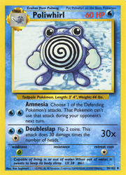
Perhaps I should have swapped Poliwhirl out with one of the cards in the previous gallery, because I was going to comment that he didn't fit said gallery of "Illustrations I wanted to highlight that I don't have much to say on" from a technical standpoint. I just didn't code my page well enough to account for having 5 cards together without looking awkward, I suppose. But I guess he also doesn't fit that gallery in terms of the art style used. After all, those are proper illustrations made for the TCG, whereas this one is the simple Ken Sugimori art that we had grown used to at the time. So, either way, he'd end up sticking out.
Still, he is a very cute card despite being so simple. There's something about water themes in cards that always stands out. Even in modern cards, a good illustration focused on water can be so cool. I think there actually was a recent Poliwhirl card that was just that. I don't remember the set though. Might have been the 151? I'm unsure. Back to focusing on this Poliwhirl instead. I really do love some of the backdrops to these older cards. I'm not even sure what to call it. It reads as water, but I couldn't tell you if it's a photo or just an abstract piece of art of some sorts. Either way, it really matches the vibe.
Base Set
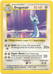
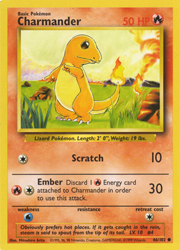
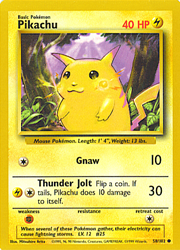
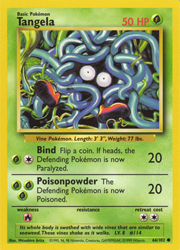
Let's shift away from nitpicking over Holos for a second. Here's a small gallery of some stunning cards. I don't have much unique things to say about these, so I've grouped them together. They're just all very neat and I love the illustrations on them. Pikachu is a classic, and Dragonair is so pretty. Even as a non-holo, it felt really special to pull that Dragonair, with the aurora in the background. It looks so mystical. Much like not having a Gengar, Base set also doesn't have a Dragonite card. Just thought I'd toss that fact in there.
Base Set
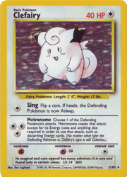
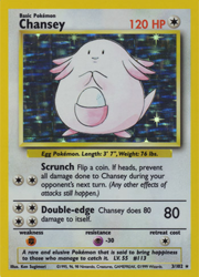
So, I'm not sure why in my mind I've grown to grouping these two cards together. I'm assuming because they're Colorless cards, on top of the fact that the Pokemon are in the old Sugimori light shading style. Oh yeah, and also the fact that they're pink. But yeah, my brain treats them as matching entities. Either way, I definitely remember pulling both of these as a kid pretty vividly. Not sure why,e ither. These two in particular never really thrilled me. I think it was precisely becaue they were Colorless. Back then, Normal types were just regarded as boring. Also, for whatever reason, I don't know what it is about it, but whenever I see a Clefairy from Base Set next to Chansey from Base Set 2 (with the very well known "Cosmos" or "Swirl" Pattern,) it looks wrong in my brain. Probably because I never pulled them both in Base Set 2 as well.
I don't know why I felt it necessary to include that little detail, but I suppose this entire entry (as well as any future entries related to the TCG,) is just filled with odd little details that I remember. So, I guess it fits here, if anything.
Funny enough, I remember they made an updated version of this same Clefairy for XY. It had the Fairy typing and was just a reverse holo or something like that, but I honestly think it looks way better. It just pops so much more that way, and does so much for the card. Honestly, the idea of getting that version of this very card seemed far more exciting than tracking down an old Base Set one. I might have to do that. Though, I do wish they kept Fairy type in the TCG. I'm not a huge pink person or anything, but the vibrant pink cards look so good.
Anyways, onto Chansey. I don't have as much to say about this card in comparison to Clefairy. I'd say, maybe it's even a bit more boring from an art perspective. However, if you were playing the TCG, Chansey seems a bit formidable with those attacks. But who knows, maybe I'm wrong. After all. I never played TCG back then, and maybe it's just the 120HP that seems imposing to me. Either way, unpopular opinion maybe? But I think this card art looks a bit better in Base Set 2, with those Cosmos foil patterns. Either way, it's one of the few cards I've owned 2 Holo variants of.
Base Set
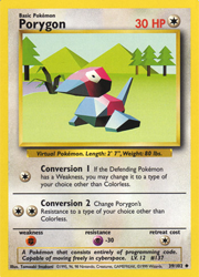
Initially, I wasn't going to put this little guy on his own. After all, there's an entire gallery of cards just like him right above. But, due to the way they all fit on the page, I couldn't find a satisfactory way to display Porygon without it looking awkward. So, let's take a brief moment to talk about Porygon.
Porygon is one of those Pokemon I don't have a lot of history with. He was always just a guy I would end up getting when I actually went for Dex completion, but I had no history of using. Especially not as a kid. I'd say the first time I even ended up with a Porygon might have been Gen 4, to be honest. Diamond & Pearl were the first time I even remotely tried going for something as daunting as Dex completion. I think the fact that back during Gen 1, having the whole Porygon Incident happen with the anime paired with the fact that you had to get a lot of coins to get him from the game corner made him feel unobtainable.
Very sad, as I've grown to enjoy Porygon a lot as of late. I really love this render as well. He just seems like he's living in his little virtual space, enjoying time out at some lake. For some reason, looking at this illustration makes me think of "A Chapel." I guess it really fits, considering that FFT was released pretty close in time to when Pokemon came out.
Base Set
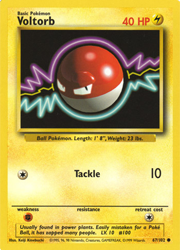
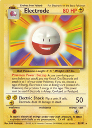
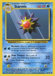
Anyways, I don't have a lot to say on every single card. Honestly, a lot of the cards I did pick were just cards I had that stood out in my mind that I could really only say "Wow, what a cool looking card! It's very neat that this exists," which isn't exactly interesting to read about 30 times in a row. With that said, I picked a few out of a lineup, and decided to make a mini card gallery real quick. The focus of these ones are the 3D renders. As you can tell from above, I really like them.
Base Set
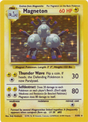
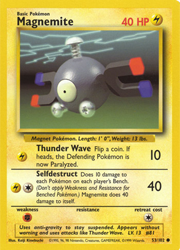
So, unlike Gastly and Haunter, I have no particular feelings for the Magnemite line. They're funny little guys that are magnets, and that's pretty neat of them. I really like the bit that when they get together, they just become a lump of idiots. It's in one of their Pokedex entries, but I forget which one exactly. Either way, let's talk about the cards in particular, rather than about the technicalities of Magneton.
So, I didn't pull this Magneton, but I definitely had it. It was one of many cards given to me by my neighbor when he lost general interest in the series. So, I suppose that's what makes it stick out to me. Back then, any Holo was essentially an unrivaled treasure in a child's eyes, and I was no different. So, while the Pokemon featured might not have been a favorite, the mere act of it being holofoil and shiny made it special. Now that I think about it, maybe that's part of why so many people are nostalgic specifically for Gen 1. You could take any old Pokemon, make whatever kind of card art, and add foil to it, and as long as kids had it back then, they'd treasure them.
Either way, the art of these 2 are neat. It's probably because of the renders that they stick out to me. I honestly really love said renders. I know they're old and dated, but they have so much personality. I don't know, maybe the appeal of it is how retro it all is? Possibly. But I also do like modern cards, even if the renders are more polished and don't look nearly as weird. I've heard some people call modern cards "sanitized," and while I could understand saying that they've been "cleaned up" in comparison to older cards like these, the term "sanitized" doesn't sit well with me. Probably because it feels like such a jab at newer stuff, and the idea that newer Pokemon is all bad. Like yes, Scarlet & Violet definitely have issues. I'm not going to argue that. But I wouldn't call modern cards "bad" either. They're just a different era of art.
Still, I enjoy seeing this Magnemite floating alone in his void, powering up an attack. He's quite charming.
Base Set
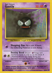
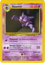
I'm going to skip over some of my big pulls of this set for now. Time to talk about some of my absolute favorite cards ever made. They may just be uncommon & common rarity, but I always really liked the Gastly & Haunter cards of the base set. I'm not really sure how to put it into words, but there's something mesmerising about these two cards. Maybe it's just the fact that Haunter was always my favorite Pokemon. But I feel like it's more than just that. Back then, we only had those 3 initial Ghost types, so there was a bit of an aura to them. Maybe couple that with the surreal feeling 3D renders of the cards. It adds a mystique to these two, which is also enhanced by the lack of Gengar as well. Back then, getting a Gengar in game was pretty hard if you didn't have a link cable to trade, so Gengar always had this feeling of being out of reach. I feel like Gengar also not being in Base Set as well only added to how out of reach it felt. Like you weren't supposed to have one. Almost made Gengar come off as dangerous, as well as the other 2 for being Pokemon that would eventually become Gengar. That and well, the fact that they're ghosts.
The backgrounds here really add a lot to the surreal feeling. Gastly's really leans into the poison dual-type vibe as well, being in what seems to be some sort of back alley, among graffiti. Really makes it seem like a person would have had to go out of their way, possibly stumbling into a place that would be dangerous to track one down. Or perhaps Gastly is even a threat to you, among everything else. I don't know, but if I were a 10 year old, I wouldn't want to see a Gastly in a back alley.
Haunter's background is a but more surreal. It's like you're in a hallway to nowhere. I almost feel like it's beckoning you to follow it to some dangerous place. It could also be chasing you, I guess? But I feel like it's more the former than the latter. The fact that there's either a warped ceiling or maybe even some sort of weird atmosphere above the Haunter adds a lot more. I feel like in some sort of space I never meant to stumble into. Backrooms vibes, for sure.
Either way, I always remember really liking this Haunter card specifically. I didnt keep a whole lot on my binder cover when I was in highschool, but I always had a copy of this Haunter in the front window. Even back in highschool, when Pokemon was seen as "a dead series," (Around the end of Gen 3 heading into Gen 4, specifically) people always still found the card pretty cool. IDK, I just really like this card.